I was the lead designer on a national heritage brand, successfully updating and modernising their online presence as part of a wider rebrand
This went hand-in-hand with usability and functionality improvements across the site.
The client’s focus was commemorating those who served during World War 1 and World War 2 and a refreshed site had to respect and emphasise this important work.
Skills: Wireframes, Design, Accessibility, User Experience
THE PROJECT
We adapted a barebones set of new brand guidelines into a full UI kit that formed the basis for every page on the site as well as a foundation for future features and promotional campaigns. This included accessibility checks in order to meet their obligation as an inter-governmental organisation.
Emphasising the charity aspect of their operation was important as this was a key revenue stream for them. We restructured page layouts to ensure this was given real prominence with clear calls-to action. The paid membership form wasn’t well-integrated into the site either so we replaced this with a streamlined built-in form to make this feel more native.
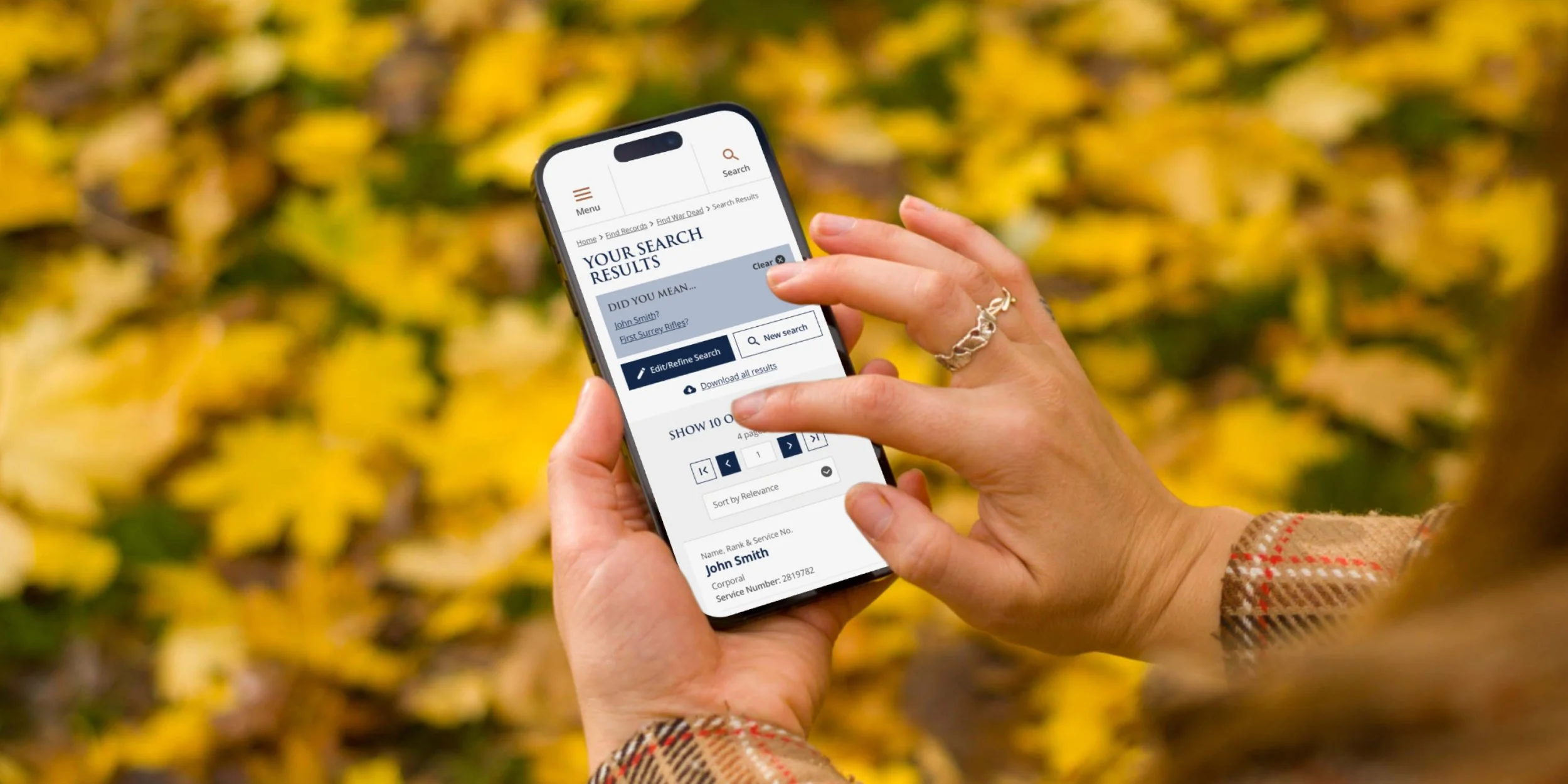
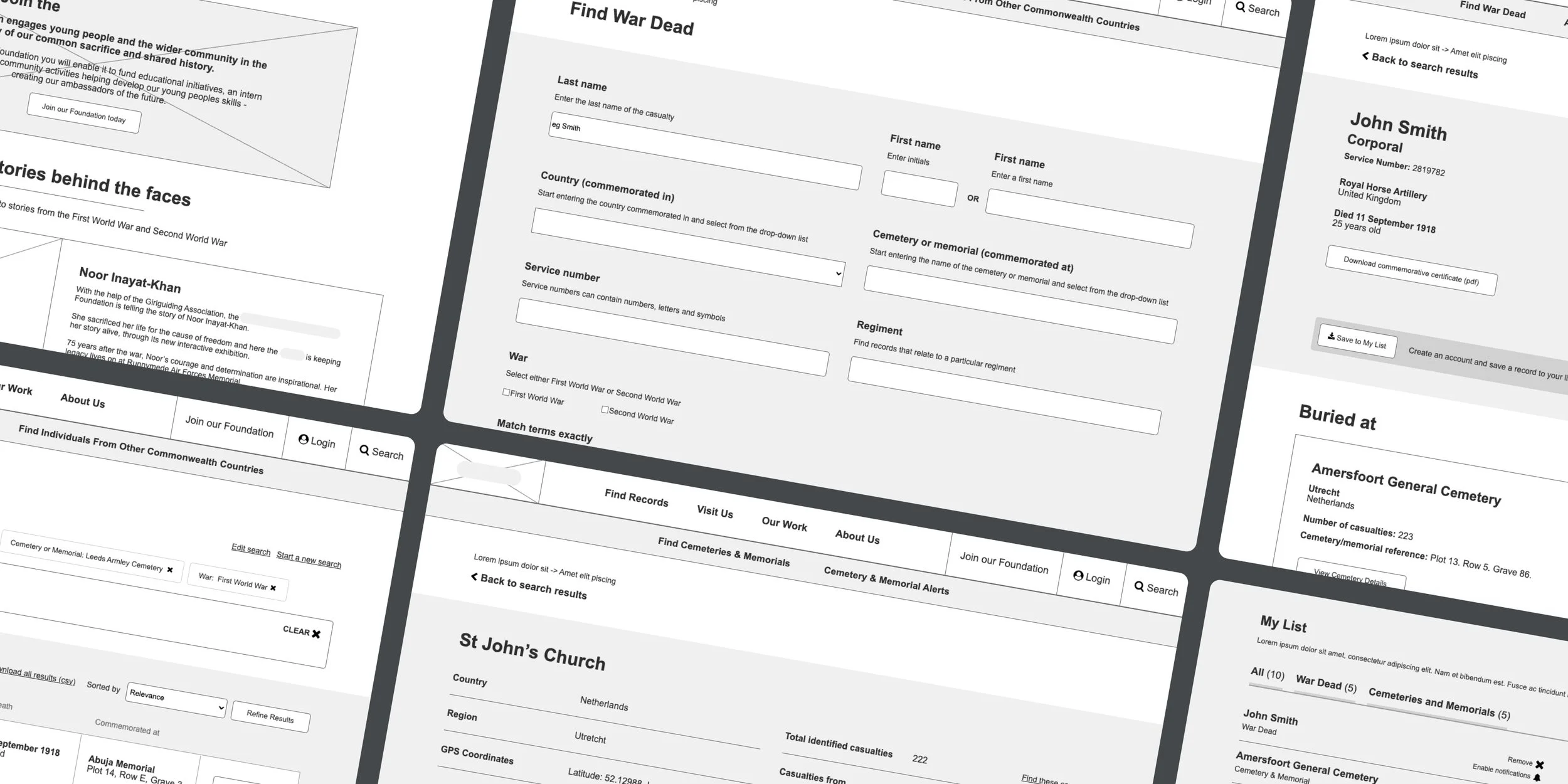
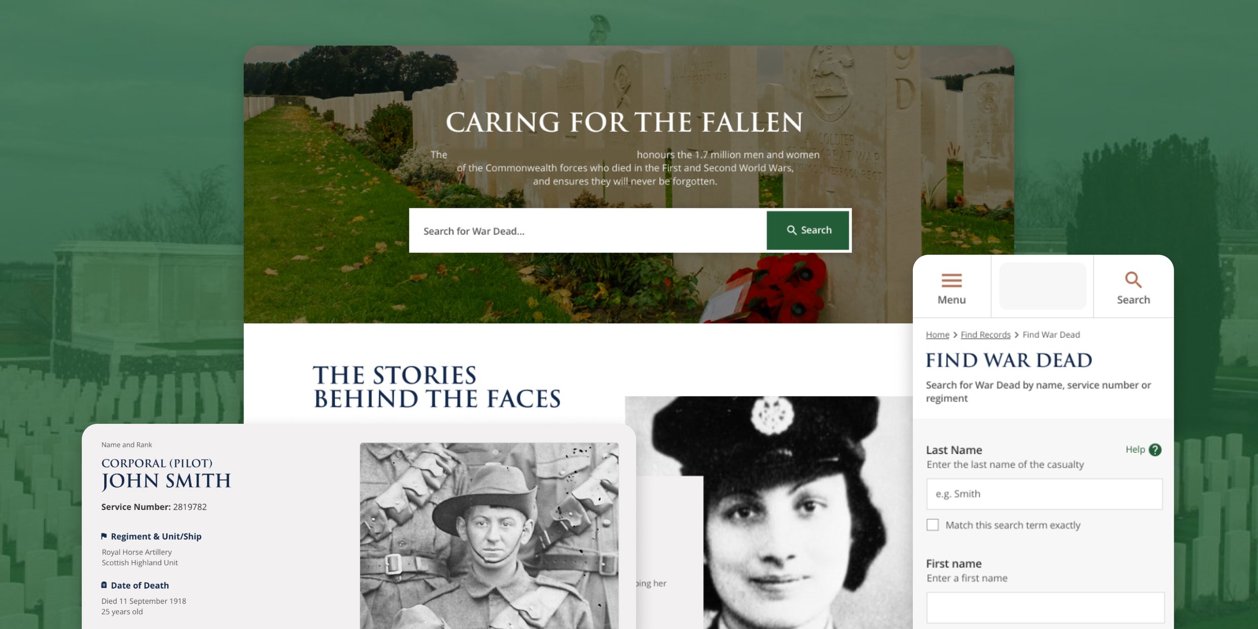
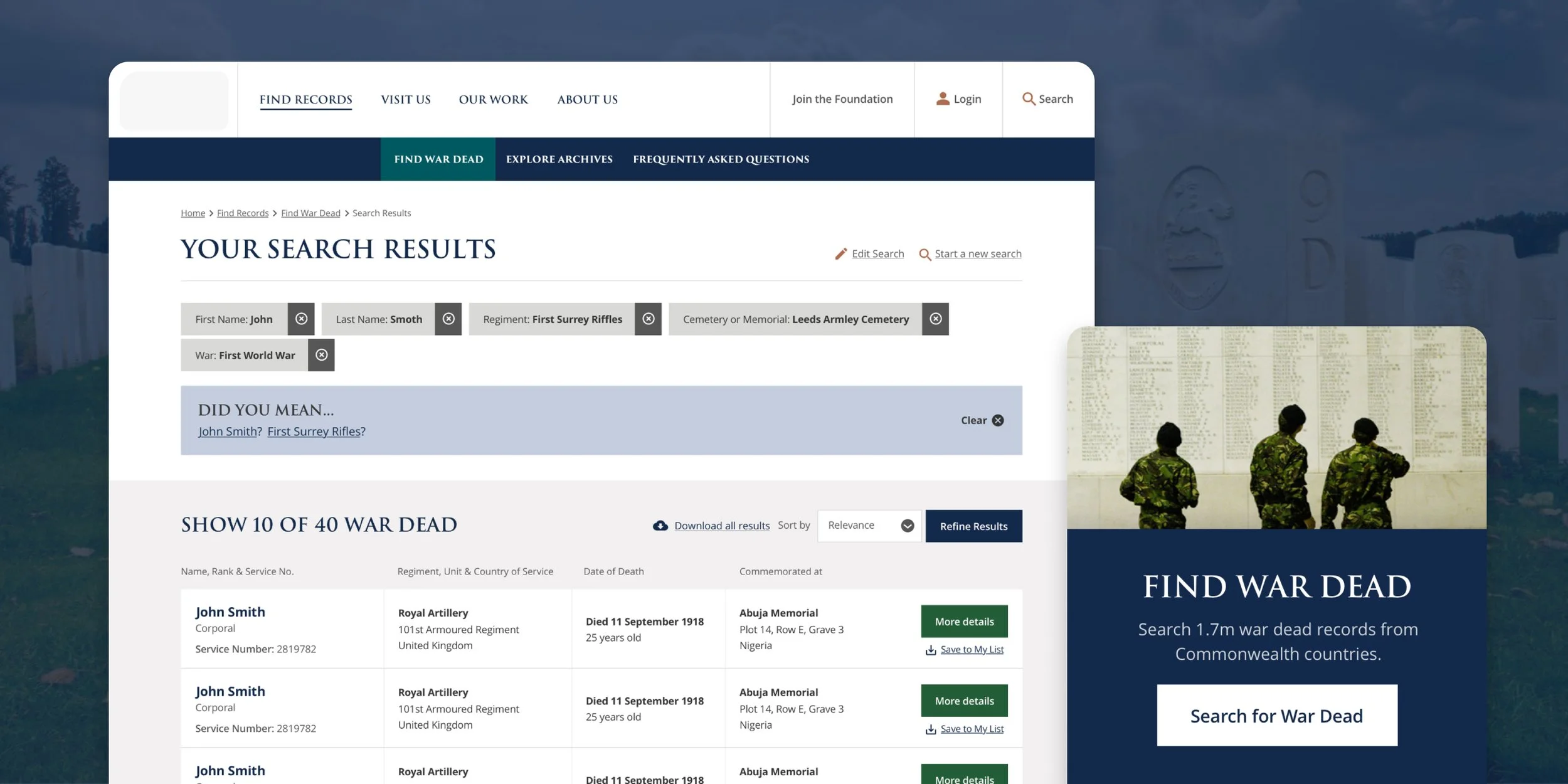
The heart of the site was the War Dead Search tool, allowing users to search a database of over 1.7 million records of servicemen and women. However the existing tool was slow and required precise details such as names or service numbers in order to return correct results.
We conducted a usability audit of the existing search tool, simplifying and improving the layout and and UX to make this easier to understand for newcomers. This was combined with behind-the-scenes improvements that improved the search speed and allowed for broader ‘fuzzy’ searches with suggested results to guide users to their correct result.
The results
14 million pageviews
Since the new site launched
6 million searches
Using the improved War Dead search tool, with over a million searches every month